The more I read text on a screen, the more I appreciate books.
I don’t mean the obvious, the stuff that makes me sound like a middle-aged nostalgic: the scent of the pages, the feel of the cover, the scrawled notes of owners past. And I’m not talking about the fact that you absorb information on paper better than digitally.
I mean that books are a technological marvel in an age of digital overwhelm. (And I say this as a lover of shiny things — particularly modern tools that improve how we consume information.)
Consider how you keep track of your reading progress. The digital solution: vertical scrollbars, horizontal progress bars, or little clusters of empty dots that fill up as you move through the work. It’s clunky. It’s useless for long texts. And it adds visual clutter; metadata that doesn’t belong on the page.
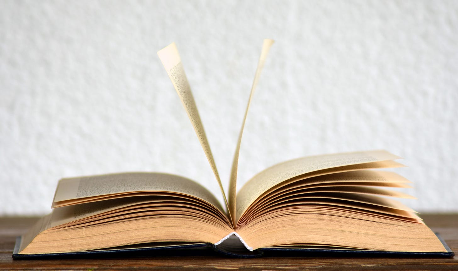
With a book, though, you can feel your reading progress. Your two thumbs constantly tell you how far you’ve got, by the thickness of the sheets each is holding down. Flip a page, add one more under your left thumb and one less under your right, and you’ll never get lost… right up to that until that triumphant, final turn.
This tracking system works for books of any length. It’s elegant, technically brilliant. It’s genius.
Then there’s the issue of design: typography, layout, margins and so on. Elements that are critical to how you experience a work.
Most digital text is formless, styled independently of content. Like this post, the author has no say in how it looks on your screen.
This is for good reason. Separating content and style allows writers to concentrate on writing, and leave the design to others. And for a post like this, it doesn’t matter much.
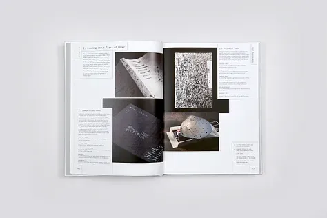
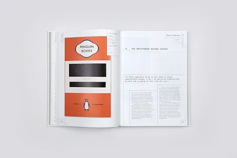
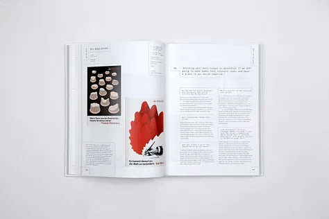
But now consider a well designed book. With thoughtful typography and layout and margins; with the cover, paper weight, and ink chosen just right. When the style befits the content, it can bring a book’s message to life in your mind’s eye. Better than even a bespoke website could.
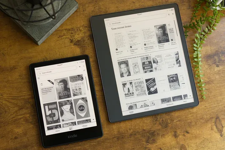
Or think beyond the reading experience, to how you select a book. The digital answer: lists or thumbnails of your e-books, one screenload at a time, compressing your library into most recently purchased or read.

Sure, physical books take up space. But look at the density of information in a loaded bookshelf, the spine of each work doubling as a display of its title and author. What a neat trick. As well as a decorative one.
In the face of dizzying change, books are an enduring technological wonder. We revere them; we fear them. Partly for the ideas they hold. But partly because they work so damn well.


